The case for building on Apple’s Human Interface Guidelines instead of around them
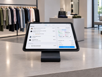
Walk into any retail store today and watch how a store assistant interacts with their handheld device. The hesitation before tapping. The sideways glance at a colleague to confirm which button to press. The subtle frustration when something does not respond the way they expected. This is not a training problem. It is a design problem.
Retail software has a long history of treating the iPhone and iPad as screens to put things on, rather than platforms with their own established language. The result is a generation of tools that look modern but behave like something unfamiliar. And on a busy shop floor, unfamiliar is expensive. Apple's Human Interface Guidelines (HIG) define how iOS apps should look, and how they should behave, the gestures, navigation patterns, and interaction conventions that users already know from daily device use.
There is already a design language your users know
People unlock their iPhones countless times throughout the week. They swipe, tap, long-press, and scroll their way through apps without thinking about it. That behaviour is not random. It is the result of years of consistent design conventions, many of which Apple has documented in the Human Interface Guidelines.
The HIG is not just a style guide. It does not only tell you which font size to use or how much padding to put around a button. It describes how people expect software to behave: the swipe from the left edge to go back, the pull-down gesture to dismiss a modal, the large, clear primary action that guides you toward the most likely next step. These patterns are stored in muscle memory. When an app respects them, users do not have to think. They just act.
This is one of the most underused advantages available to anyone designing software for iPhone and iPad. You do not have to teach your users how to use your app. They already know, if you let them.
This split defines what we call the Platform Dividend Model, a two-layer approach to professional app design. Layer 1 is the Platform Dividend itself: the behaviours, patterns, and accessibility standards HIG provides for free, inherited the moment you build with the platform rather than against it. Layer 2 is the Domain Investment: the design work only you can do, mapping your users' specific workflows, pressure points, and environment. Most retail apps spend their entire design budget on Layer 2 problems while unknowingly destroying Layer 1 value. The opportunity is to stop doing both at once.
Custom UI Patterns in Retail Apps Increase Cognitive Load and Training Time
Custom UI patterns can feel like a competitive advantage. A unique interaction, a proprietary navigation model, or a distinctive set of gestures can seem like expressions of a strong product identity. In consumer apps competing for attention and engagement, there may be an argument for that approach. In professional tools used under time pressure, in noisy environments, by people who may have joined the team last week, that argument falls apart.
Every deviation from platform convention is a small tax on the user. Each unfamiliar pattern requires a moment of conscious processing: what does this do, how does this work, is this the right button? Those moments add up. They slow people down, increase errors, and create the need for training that would otherwise be unnecessary. The recommendations in the HIG are not simply aesthetic preferences. They reflect years of platform learning about how people navigate touch interfaces. Building against them is not differentiation. It is friction. This is consistent with cognitive load theory, each unfamiliar interaction pattern consumes working memory that should be directed at the task itself, not the tool being used to complete it.
Every custom interaction has a cost. In retail, that cost is paid in hesitation, training time, and mistakes on the shop floor.
HIG Principles Retail Apps Consistently Underuse
Consistency in interface design is often treated as a visual concern: matching colours, aligned grids, the same corner radius applied throughout. That is the surface level. The deeper kind of consistency is behavioural. It is the guarantee that a certain gesture always does the same thing, that a certain visual pattern always signals the same meaning, and that the mental model a user builds on day one still holds on day thirty.
When an app follows platform conventions, it inherits part of this consistency from the operating system itself. Users who know iOS already know a significant portion of how to use the app before they open it for the first time. That knowledge transfers. And when it transfers reliably, users stop being cautious and start being fast. In retail, where a transaction needs to be completed while a customer is standing in front of you, that shift is not a nice-to-have. It is the whole point.
Some of the most valuable things in the HIG are the ones that rarely make it into a product demo.
- Dynamic Type support, which lets users adjust text size from their system settings and have apps respond accordingly.
- Clear colour conventions for status and action, such as red for destructive actions and system blue for interactive elements.
- Navigation patterns that mean a user who gets lost can always find their way back, because the back gesture works the same way everywhere.
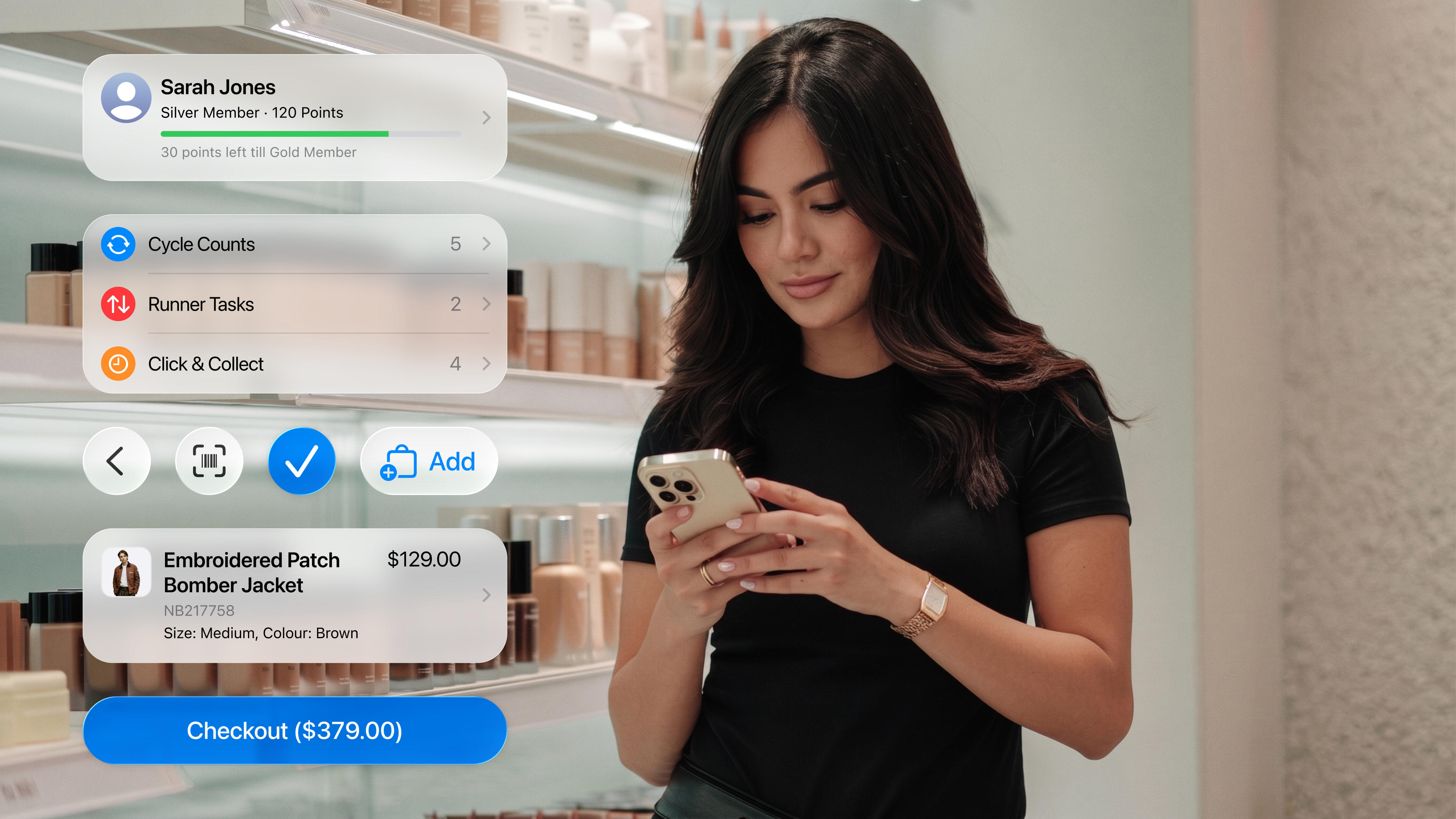
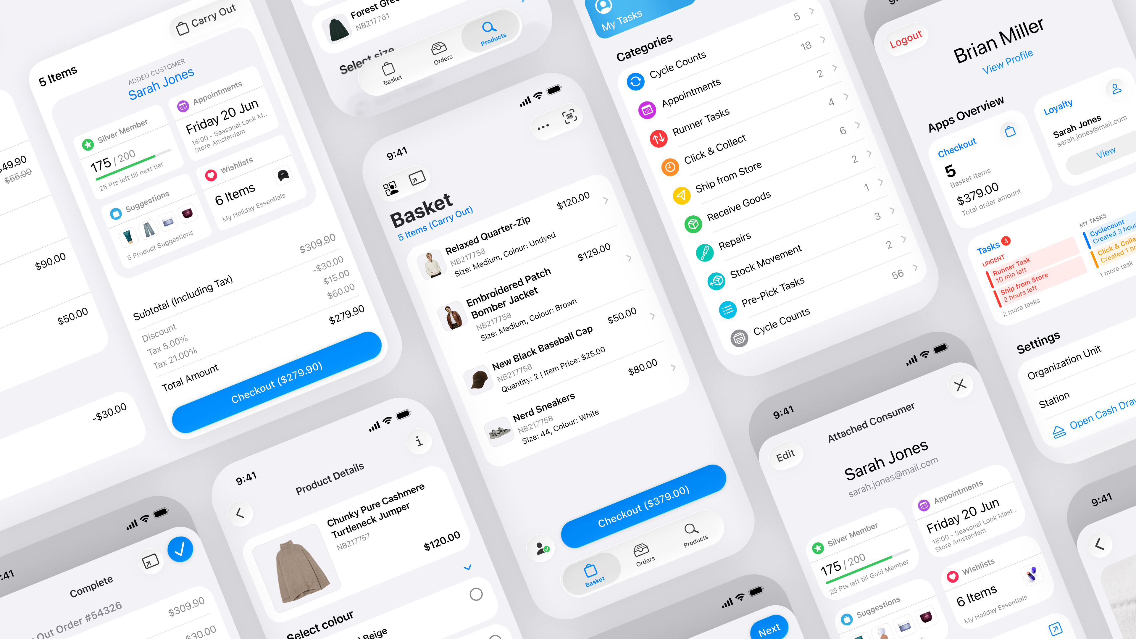
I noticed this most clearly while designing native iOS apps for retail employees. In a checkout flow, something as simple as allowing a basket item to be swiped for quick actions, using a long press for secondary options, or keeping the primary checkout action visually dominant makes a real difference to how quickly someone can work without thinking. None of these interactions are revolutionary. That is exactly why they work.
HIG-Native Apps Reduce Long-Term Maintenance Cost
There is a longer-term advantage that is easy to overlook. Apps built on platform conventions tend to stay current without constant redesign effort. When Apple updates iOS with new visual language, interaction patterns, or system components, apps that closely follow the HIG can adopt those changes more naturally. System colours and materials adapt. Standard navigation components evolve. The app feels current because it is rooted in the platform, not bolted onto it.
Apps built on fully custom design systems need to be actively maintained against platform drift. Every iOS release creates a potential gap between how the operating system behaves and how the app behaves. Over time, that gap makes tools feel dated, even if the underlying functionality is still strong. Building on the platform is not a shortcut. It is a long-term investment in staying relevant.
Where to Invest After HIG: The Layer 2 Design Problems Only You Can Solve
The Platform Dividend Model clarifies where the real design work lives. Layer 1 is not your job, it is already done. Navigation, interaction patterns, accessibility, visual language: these are inherited. Layer 2 is entirely your job. Understanding the specific workflows of your users. Mapping which actions happen under pressure and which happen with time to think. Designing for loud spaces, moving people, interrupted tasks, and devices shared across shifts. That is the hard problem. The HIG solves a different one, so you do not have to solve it from scratch.
The best apps built for professionals are not the ones that invent an entirely new interaction model. They are the ones that understand what the platform already gives you, use it fully, and then spend their design effort on the problems that only they can solve. Retail apps do not need to teach people a new language before they can do their job. The language is already there, in the device they use every day. The design opportunity is not to replace it, but to use it well.